Friday, November 19, 2010
Typography 3 Project 3
A poster about 5-15 typefaces of our choice... I chose display typefaces, and the rational is on the very right side of the poster so I won't repeat it here... The printed thing is 59"x10.5" By far the biggest thing I've ever printed...!
It reads "DISPLAY" in the negative space... It looks less obvious when you look at the actual poster which makes it more interesting when you do realize... The idea for that actually goes to my friend Alex at ocad, he saw me doing this and thought it would be cool if I wrote something in the negative space, which turned out to be a major part of the poster composition! Thanks Alex, check out some of his works here: http://giantdays.tumblr.com/
Stamps!
Stamps to commemorate something Canadian! I chose to make my stamps about the air show, and specifically the planes that are significant and iconic to Canada's aviation history (I don't have a "thing" for planes, but they are very cool!)
So this project specifically said we had to make 3 of a series, so consistency was a factor... Also the 57 and CANADA are required.
Monday, November 8, 2010
Friday, November 5, 2010
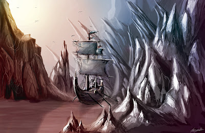
Viking ship
Publication Design, Annual report
We had to make 3 spreads for an annual report for a company/organization of our choice. I chose Audi because lately my brother has been obsessed with getting one and it was the first company that came to my mind. I actually like the company now I have been successfully brainwashed after looking at their past annual reports.
My concept is to have the annual report for 2010 move toward a more "in the context of the user" direction. I looked at their past reports and they used a lot of stylized photographs before and rarely showed the vehicle in the context of the user. But looking at their 2010 first quarterly report I was disappointed to see one of those motion blur kind of pictures with the car, it made it look cheap and less elegant. SOOOoooo.... I thought if that is the direction they want to go to (as opposed to the stylized pictures) they can still convey the elegance of the car when it is parked.
So yeah I searched the interwebz for pictures of Audi cars in that sort of position... for 3 days.. that's right, it took me three days because I needed super high resolution pics... and finally here it is...
the middle spread is a content spread. Audi has a habit of giving themselves good adjectives followed by their logo.. so I though.. okay.... u like good adjectives and logo why not make a table of content with just that!? Each circle is a chapter: Originality, Understanding, Precision, Sustainability. And the ares they overlap are sub chapters: Originality and Understanding result in "Cult Icon". Understanding and Precision result in "Success", Precision and Sustainability result in "Efficiency"...
And finally the last spread is a spread of one of their articles, the text is mostly gibberish because in terms of deign it doesn't make much difference. On the left there is an info-graph though... see if you can figure out what its saying.
Publication design 1, Feature Story
So these are two spreads I had to design for a magazine of my choice. I went with Wired magazine because I'm 25% nerd and 50% designer and 25% artist.... it is made for me
Anyway, we had to approximate how a feature story would look like in that magazine.. and i did a fantastic job, not because I think so, but because the next issue of wired that i received after handing the project in actually had a cover story with such a similar style that I thought they had copied me... lol
Graphic Design 3, 5 Steps to Use Something, something
So basically we had to choose an object and explain how to use it in 5 steps.
I chose my tablet pen, and in the instructions I showed how to change the nib in 5 steps.
I decided to go with a painted look because I wanted the page to look less intimidating for the reader... if it was really high tech looking, I thought it would make the user thing they could screw up while its catually really easy to change the nib... also it illustrates some of the things that can be done using the pen because I used the pen to draw this... anything vector-looking, could have been done with a mouse. Also its supposed to make you want to draw stuff :p
The project outline was: make a box. That's it. He refused to explain any further what he meant by that and he said we have all year to work on it so we assumed it had to be something really conceptual and crazy lookin'
I decided to do love as box. I took pictures of garbage all over Toronto (it wasn't hard at all, but people thought I was insane) then I put cliche love phrases and expressions in the middle of them. What this is suppose to show is that we recycle love and as much of a unique and special thing as it is supposed to be, in the end we use expressions that have been used over and over again. You could interpret it in many many other ways. For example you could say the opposite: people aren't "sharing the love" they are throwing it out in the garbage..
Graphic Design 2 Project 1 B (Letter and Sound Synesthesia)
Well, my teacher didn't ask for a video for this project. All he said was we had to create a "found alphabet" meaning, create all the letters of the roman alphabet with a theme. For example, some people in my class made theirs our of garbages, or buildings, or shadows... I "found" my letter from magazines, but I thought that was waaaayy toooo eaaassyyyy, so I though "I wonder if this letter shape had a sound what it would sound like" No i wasn't smoking or drinking anything weird. Think about it! its like a synesthesia (where one sees colours when they see a number) only instead of seeing colours and numbers, its sounds and letters!
Typography 1 Project 2 Part B
Typography 1 Project 2 Part A
Introduction to Photography, Light Painting
Graphic Design 1, Project 3
Drawing As a Graphic Designer Project 4
We had to make a signage system for ROM (Royal Ontario Museum of Art) and we weren't allowed to use numbers or letters and it had to be somehow related to ROM itself.
My design was inspired by the (new) exterior of the building, if you haven't seen it google it, it looks kind of crazy.
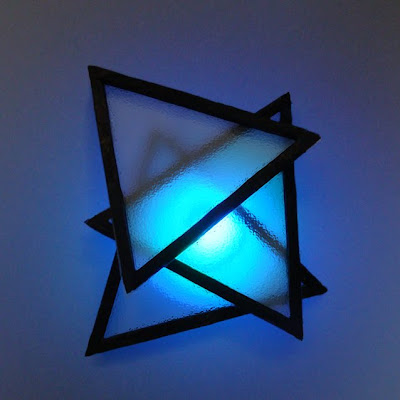
I made this with matches, transparent paper, glue, camera, blue light
Thursday, November 4, 2010
Drawing As a Graphic Designer Project 3
This one we had to make Stamps for some tea flavors... The flavors were given but we could pretty much do anything. I took over 300 pictures of colours dropping in water, went through all of them, did some tedious manipulating in photoshop and came up with these. They are landmarks/symbols of the places they come from. Also I didn't want to be stereotypical which I think I did a good job of.
Drawing As a Graphic Designer Project 2
Here we had to make an "ex libris" which was something like a logo that libraries or book collectors stamped inside their books and it was unique to each collection.
I don't remember why I chose to draw a hand but i probably came up with some really good BS because I remember I got a decent mark on this.
Those white things are light coming through holes I punched in with a needle :D
Subscribe to:
Posts (Atom)